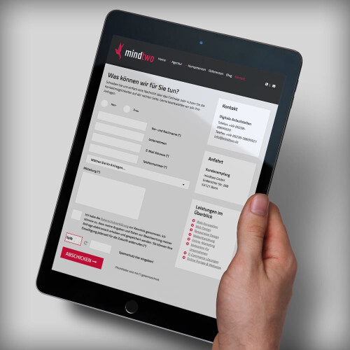
Visitors come to a website with a dedicated intent and a specific goal in mind. They intend to achieve this as quickly and easily as possible. When visitors need to fill out a form to reach their desired goal, this can objectively be seen as a barrier at first. However, forms remain one of the most important interaction elements on the web and are often viewed as the final step to achieving the goal.
Therefore, when designing and configuring forms, it's essential to make them as simple, quick, and hassle-free for the website visitor to fill out as possible.
Typical Structure for Online Forms
Most online forms typically contain the following elements:
- Structure: This refers to the general layout of the form. In what order and positioning are the input fields arranged? How are they related to one another? Which mandatory fields are used? How will the form look on the website?
- Input fields: Text fields, checkboxes, radio buttons, selection menus, password fields, etc.
- Title of the input fields: The title of a field explains to the user exactly what to enter into the particular field and why they should fill it out.
- Completion Button: Once the user activates the button, an action is executed - in most cases, this is the submission of the form data.
- Feedback: Following the form submission, the user should receive feedback - either "successfully sent" or "the following fields contain errors".
Additional features can include "Tool Tips," small help texts for filling out the form, or an automatic validation of the input, as well as visual visualization of this.
Structure and Design of the Form
A form is intended for conversation with the user and should therefore be logically structured and easy to understand. At first glance, a form appears to be a rather simple element used on a website. However, numerous details must be considered and there are many options for design and structuring that you can apply.
Before you delve into the details of form design, always check whether you are really only asking for the essential information and data from the user. Ultimately, every additional query jeopardizes successful conversion.
Logical Groupings of Information Queries
Information that is related should be grouped into a meaningful block, as this creates a certain "flow" when filling in and follows the structure of a conversation. For example, "Personal Information" (name, first name, date of birth), "Account Information" (email, username, password), and "Contact" (address, telephone number) can be grouped into inquiry blocks. This leads the user unconsciously and intuitively through the form and also makes it easier for them to understand which information is being asked for.
Single-column Form Layout
Some forms use multiple columns side by side to make the form appear shorter overall. However, users are often confused by several columns and perceive the form as inconsistent. If two columns are used side by side, the natural flow from top to bottom is interrupted, as the form must be read in a Z-pattern. Therefore, try to design your form in just one column, so the user can process it from top to bottom without complications.
Fewer Fields, the Better
Less effort in filling out the form typically leads to an improved conversion rate. Consequently, each input field should be critically questioned regarding its necessity - this is especially true if a lot of information is being requested. Ideally, no more than seven fields should be queried per form step. So, always make sure to give the website visitor as little "work" as possible by consolidating all necessary questions and information into as few fields as possible. This makes the form more organized, allows the user to fill it out more easily and quickly, and ultimately leads to it being submitted more often.
Sparse Use of Optional Fields
Also regarding the number of fields, you should only use optional fields when the requested information provides real added value. If you ask for voluntary information, make it clear that these are voluntary details. It has proven effective to highlight mandatory fields with an asterisk (*) and an explanatory footnote, and to mark optional fields with the addition "optional". This way the user can easily recognize which form inputs are voluntary.
Input vs. Preset
Dropdown lists that provide input options often lead to errors. For example, the visitor's country of origin is often queried, and the form then offers a list of all countries. However, it can quickly happen that the user clicks the wrong option or glances over this field as already filled out, thus submitting incorrect information. A better option is an automated function: the form automatically suggests the country after the user has entered their address.
Input Masks
Input masks can help to enter data in the correct format. When entering a phone number, the area code is automatically enclosed in parentheses - that is, the form formats the data itself. When typing in serial numbers, users can simply enter the sequence of digits and letters, and the form automatically adds the correct separators. This makes it easier for the user to enter data and helps to avoid careless mistakes.
Keyboard Operation and Focus
For online users who prefer desktop operation via the keyboard, and also for the sake of barrier-free processing, you should ensure that your form is "keyboard-friendly." Navigating through the form, switching between input fields, and entering data should be easily possible via the keyboard without the need for a mouse or trackpad.
In addition, focusing on the form field that is currently selected and thus being filled out helps the user - regardless of how the form is operated - to keep track and directly recognize which information is currently being asked for. The input field can be highlighted in color, emphasized by zooming, or marked with another visual signal.
Mobile Device Forms
Mobile online usage continues to increase, and websites or web applications, including the implemented forms, must therefore be easily operable with a tablet or smartphone as well. A simple but very effective aid, which you can probably confirm from personal experience, is the automatic display of the appropriate keyboard depending on the requested input. For instance, if a form field requires entering numbers, such as a phone number, then the number keyboard will automatically be displayed on the mobile device, as entering letters would not be useful in that case. For text fields, the letter keyboard will be displayed. The automatic display and switching enable quick filling out of the form.
Auto-Complete
Due to the increasing use of mobile devices, when designing forms overall, you should only provide manual 'typing' where necessary. The auto-complete feature can assist in this matter. In this case, the visitor only types the first parts of an address and is then offered possible addresses for auto-completion. The mobile user will be grateful for this, but even on the desktop, the feature helps with quick and easy form filling. Additional benefit: The automatic completion also results in fewer input errors.
Meaningful Field Titles
The title of a field is one of the primary elements of the form that allow an intuitive handling of the form. A well-chosen title for the form field clearly explains the purpose of the field to the user, enabling the correct data to be entered. It remains useful during input and, importantly, visible even after input has been completed.
Alignment of Field Titles
There are three options for the alignment of titles:
- Next to the form field, left-aligned
- Next to the form field, right-aligned
- Above the form field
Studies have shown that forms can be filled out the fastest on average when the titles are placed above the form field. The form can be processed most easily by the user with the titles positioned above, and this alignment offers additional advantages. Different sized form fields and also various title lengths can be easily displayed across different screen sizes, especially on mobile phones. Translations of field titles and thus further variations in length can also be easily accommodated.
With left-aligned field titles: the shorter the title, the further away it is from the actual form field, slowing down the completion process. These gaps make this type of arrangement unsuitable for mobile devices, as they take up a lot of horizontal space.
The right-aligned positioning places the title immediately to the left of the field to which it refers. This makes the label and field appear connected, as there is no empty space in between. This works well for short forms. However, this type of positioning is difficult for longer forms, as it is harder for the user to read because there is no uniform left edge for orientation.
Length of Field Titles
Here, the motto "Keep it short and simple" applies especially. Use clear, short, and appropriately descriptive field labels. If well formulated, the short descriptions help the visitor to quickly get an overview of the form so that orientation during the actual completion process is easier. Short and concise titles allow the user to quickly grasp which data is required and are not held up by long sentences. If you need an email address, it suffices to use "Email" as the label rather than asking "What is your email address?"
Clear Formatting
A popular but not always suitable stylistic device is the exclusive use of capital letters. This might seem at first glance like a good formatting choice for form field titles. However, the lack of variation in letter height makes it harder for the eye to read. The visitor thus has more difficulty scanning the form than with a formatting in regular upper and lower case letters. That, in turn, slows down the process and thus makes filling out the form take longer.
Inline Labels
Using so-called inline labels, meaning text that stands within the form field and describes it, can make good use of space. When clicking into the field and beginning to fill out, the label disappears and is overwritten by the entry in the field. Especially for very short forms, this can be used very effectively. When asking for an email address or other "short" information, inline labels can be employed. However, for longer forms or more complex information queries, it is advisable to rely on field title positions outside the form field itself. This way, the user can always understand what was requested in a field and whether they have entered the appropriate information.
Checking Inputs
You should let visitors know during the completion process whether the entries made are valid. If an entry in a form field is invalid, this should be immediately apparent while filling out the field. Thus, the user can directly see that they need to check their data. This "real-time validation" informs the user promptly so that errors can be corrected immediately. This is especially recommended for long forms. Otherwise, the visitor takes the time to fill out everything, only to find out when trying to submit it that corrections need to be made.
Saving Entries
It often happens that the website needs to be reloaded while filling out, so it is an advantage if the user's already entered details do not get lost. Such safeguarding mechanisms prevent frustration in the visitor who can then continue with completing the form as seamlessly as possible thanks to the still existing data.
Visually Distinguish Form Buttons
A button on a form serves to trigger a specific action after the form is filled out in full. In most cases, this will be data transmission. If there are several actions possible on a form page (e.g., "Continue"/"Cancel"), they should be clearly visually distinguished from each other, so that the user can easily perform the right and intended action and reach their desired goal.
Placement of Buttons
The position of a button is often associated with an action out of habit, without the website visitor having read the label of the button. Therefore, when creating the form, you should make sure to place the buttons in a logical and proven position. A button that triggers a confirming action, such as "Send", "OK", or "Next", you typically place on the bottom right. There the user will expect it and thus avoid triggering a wrong action that would delay the form processing.
Titles of Form Buttons
Even if a simple form with the button title "Send" makes it probably clear that clicking the button will send the data, it is nevertheless always recommended to be more specific. Choose instead a title that exactly reflects what the button will trigger: "Send form", "Create account", "Subscribe to newsletter". In addition, such communication is more direct and personally addresses the user, even if in detail.
Chatbots Instead of Forms
As people spend more and more time online and increasingly communicate through various messenger services, they place greater value on online forms resembling a conversation more closely. In this context, clever chatbots can already replace forms with a question-answer algorithm.
Forms - Details Matter
Forms are often perceived by online users as a necessary evil that is of course needed in many cases and makes sense. However, in any case, it is generally important to make the forms used online as comfortable and uncomplicated as possible for the user. The details mentioned for the individual form components are helpful and a useful guide. You can also gain deeper insights by A/B testing your forms. Sometimes it can help to simply ask a colleague to test your form. This can also provide valuable feedback.
Good luck with designing your forms!